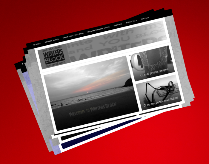
Recently we had an opportunity to work on a website. The client commissioned the project through us, and we were involved with the entire process of creating the site, right from conceptualising, to writing and designing. Happy to say, the website went live a week or so ago, a bit of changes and corrections still on; once all that is done, we’ll post the link here.
Link… we use that word so casually now, part of all our lives as the digital word proliferates and burgeons, and we interact with it more and more. This idea of a “link” which moves you rapidly from space to space, how it changes everything, doesn’t it.
Working on the navigation of the site, figuring out what would lead to what, where which piece of writing would go, at what juncture, in which format… we had to of course roam around the site quite intensely often. One moment you’re at “Our Philosophy”, next you’re at “People”, in seconds “Platforms”. Click through to inside pages and see things in more detail. How about moving from this page to that, is the tab on header menu working, is it taking you where you need to go? Or is it static and you’re sitting there frustrated like a passenger with seat belt on waiting in a plane that’s delayed.
Now if you’re thinking of the passenger, and your mind is flying elsewhere, we’ve committed a mistake in design. We’ve given you a “link” that will take you away from this story. Our digital partner kept telling us not to provide too many links to other sites, it would make the visitor leave and not come back.
We’d never thought of that. It was a nice learning, there were others.
As we worked we realised, a website is not really a flat medium at all, it has dimension.
Though we use print medium words like pages and text and header and footer, the experience is quite different. While we are looking at a flat screen, there is a sense of not just length and breadth, but depth; the links keep drawing you in.
There are layers, and you can lead the visitor gradually into your world, revealing what you wish to, when you wish to. Understanding this and designing thoughtfully so that the visitor experience is positive as the journey unfolds, is key if you wish to get the most out of your website. Of course, you can communicate through writing, graphics, sound and music, the drama of audiovisuals and films, and perhaps most importantly, you can invite the visitor to interact with you.
In a sense, it’s a bit like what Lewis Carroll had imagined all those years ago. Alice’s travels may have been possible only in a dream, now a link takes us seamlessly where we please. And we’ve almost stopped thinking of it as something wonderful, or even impossible.
We look forward to building more websites and learning new things as technology takes us on its fascinating path.
………………………………………………………………………………………………………………………………………………….
BRAND BOOKS | BROCHURES | COFFEE TABLE BOOKS | CORPORATE LITERATURE | DIGITAL CONTENT | EVENT COLLATERAL | HOUSE MAGAZINES | LEGACY BOOKS | SCRIPTS | SOCIAL MEDIA CONTENT | SPEECHES | WEBSITES | WHATEVER NEEDS TO BE WRITTEN
